Travelmaster
User experience/ User interface design
The Problem
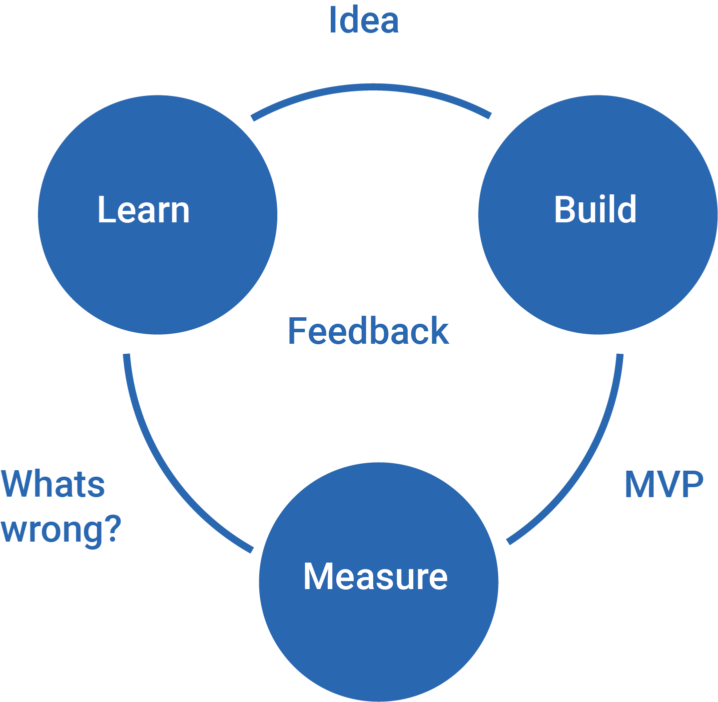
Lack of communication between TravelMaster’s team and customers. Customers expect to know time of arrival for buses picking up and dropping off. Customers are not being notified when a bus is on the move. While approaching these problems I adapted the Lean UX methodology as laid out in Jeff Gothelf and Josh Seiden book Lean UX.
Responsibilities
Qualitative Research, UX Design, UI Design, Prototyping and Testing
Feature Prioritization
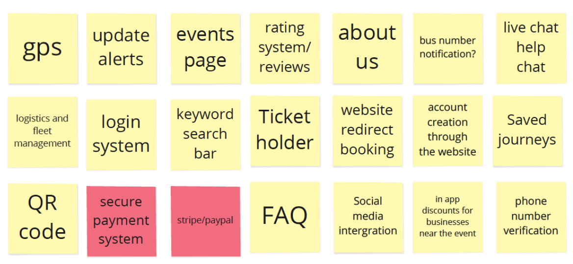
Feature prioritization is the process of identifying business goals and using a matrix to weigh their value, score their priority and inform the development roadmap. Using a feature prioritization matrix with all stakeholders allowed for the viability of features to be assessed (scoring from 1-5) under different headings such as 'UX feasibility' and 'Impact on user'.
Survey Results
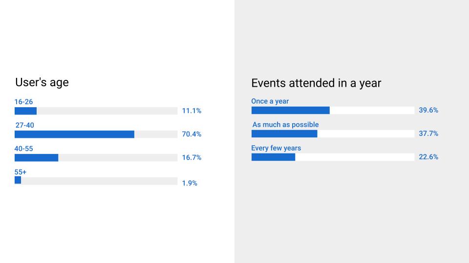
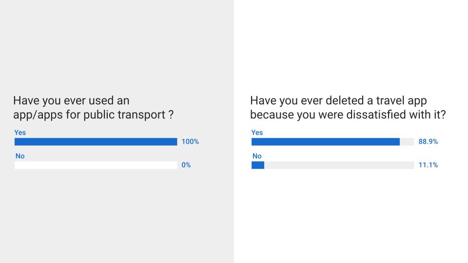
Conducting a survey using a mix of both quantitative and qualitative questions allowed for a greater understanding into Travelmasters customer base. The goal of the survey was to produce actionable insights that could be implemented into the prototype while confirming previous assumptions.
Experience map
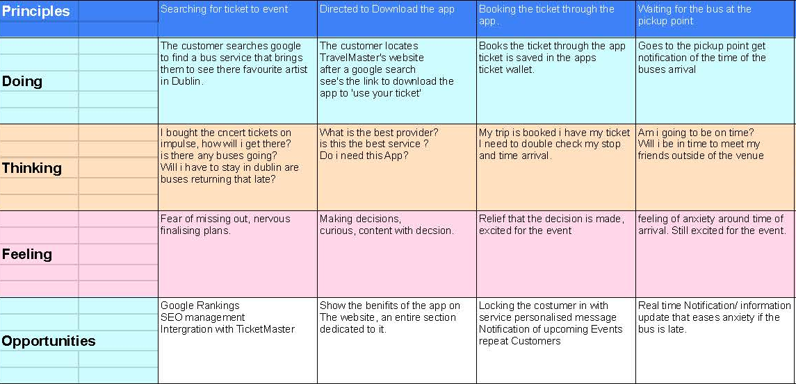
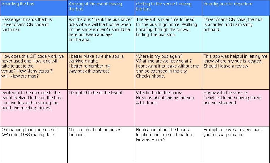
The experience map uses guiding principles as a way to relate it back to themes that emerged through research (problem statements/hypotheses). These principles included reliability, updates, booking, GPS tracking and the QR code. The experience map essentially follows a story and Like any good story, there’s a beginning, a middle, and an end.
Personas
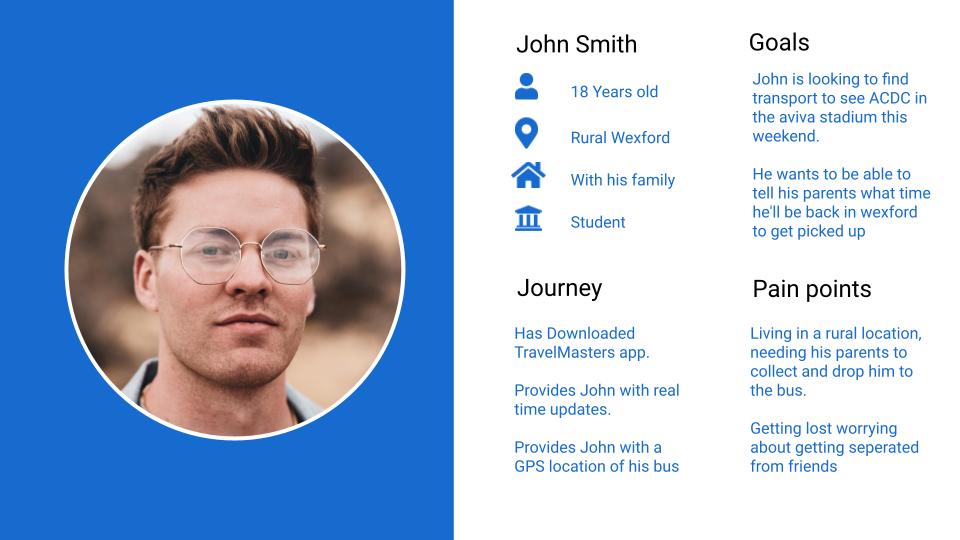
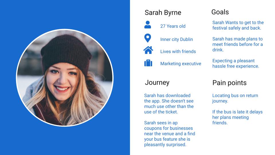
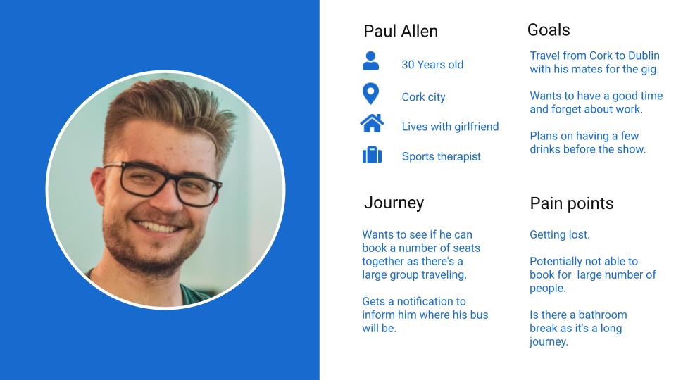
A persona is simply a fictional character created to represent a user type that might use your application. The personas describe the goals, desires, and behaviour of a hypothesized group of users. Market segmentation was important to consider while creating personas “Market segmentation is the process of dividing your target market into distinct groups. While Creating personas I got a better understanding of Travelmasters target audience, their needs and pain points.
Task Flow Diagram
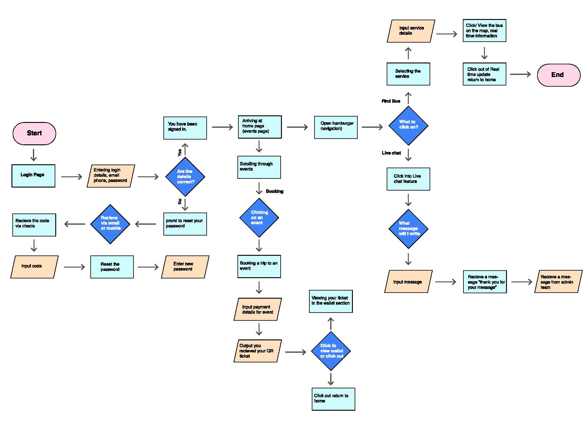
The task flow diagram illustrates how a user would get to a specific goal or end point relating to the application and also help elevate potential cul-de-sacs the user could face. My diagram allowed visualisation of different goals and interaction such as login,finding the navigation,locating the booking system, locating the live chat feature and exploration of the application.
Design MVP
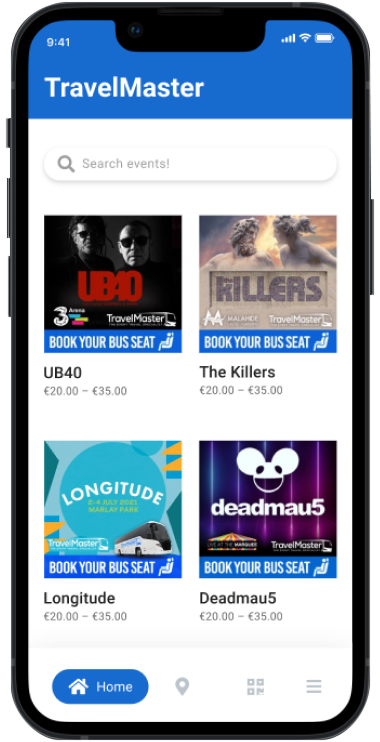
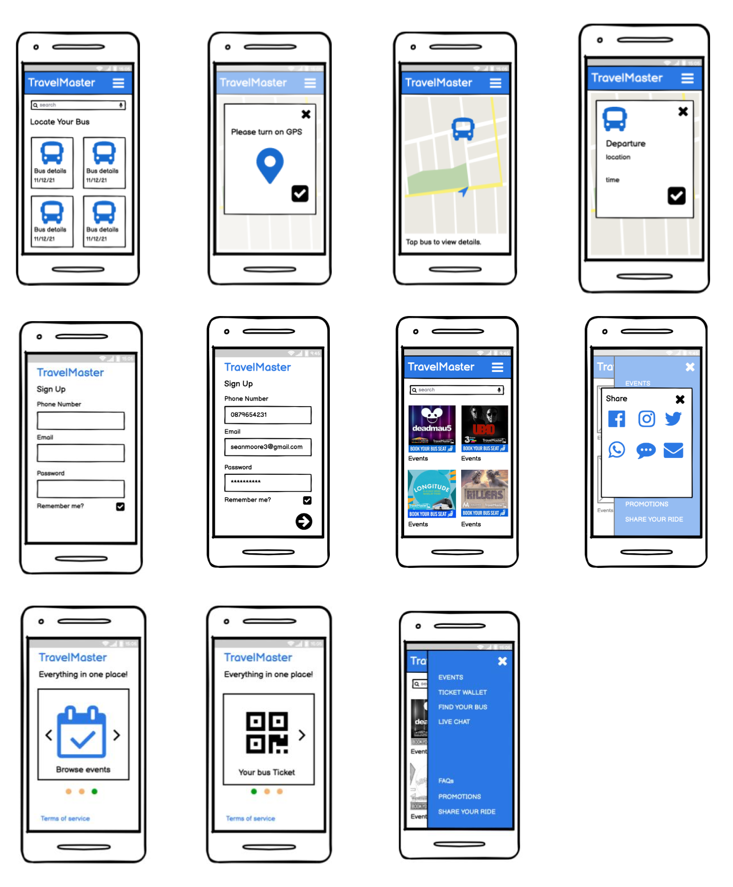
Fleshing out an initial design for Travelmaster allowed the creation of something that could validate assumptions through user testing and could be iterated on after testing using the concept of build-measure-learn.
User Testing (System Usability Scale)
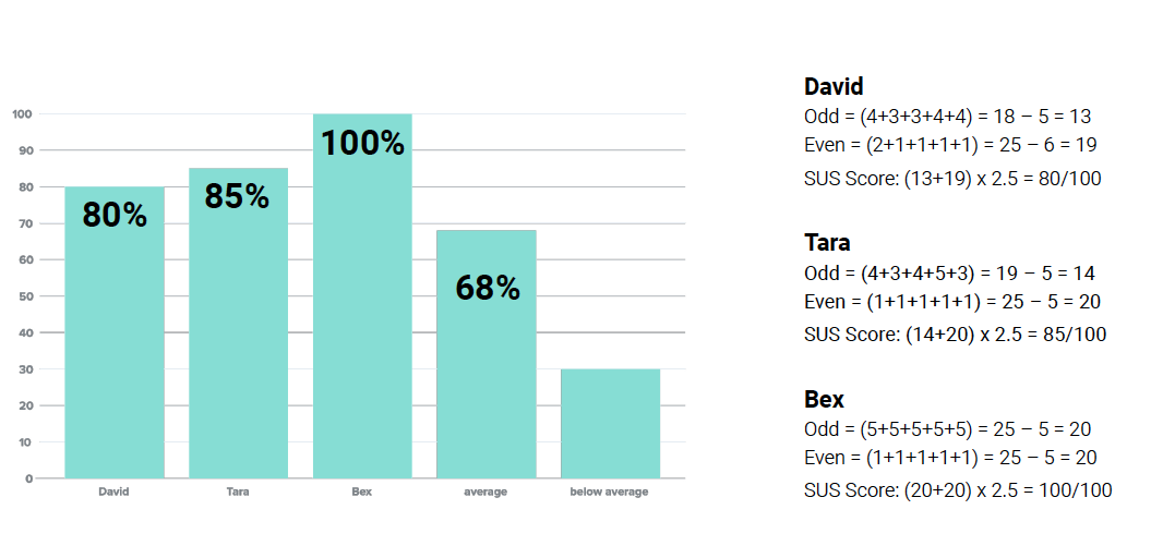
I followed a testing script defined in Steve Krug’s Rocket surgery made easy. I spoke about how we were ‘testing the application and not you, you can’t do anything wrong’ I applied the System usability scale to measure the applications usability.
High-fidelity prototype
