Irish Motor Tax Website Redesign
UX/UI • B2C • REDESIGN • MOBILE/DESKTOP DESIGN
UX/UI • B2C • REDESIGN • MOBILE/DESKTOP DESIGN
Reevaluating the current renewal process of the Irish motor tax website. In an attempt to reduce usability issues with the current website, and lead to an overall better experience for users.
Owned the UX Design process from concept to completion.
February 2023 – June 2022 | UX Tree Mentorship program.
Qualitative/Quantitative Research, UX Design, UI Design, Design Thinking, Prototyping (Figma) and Testing.
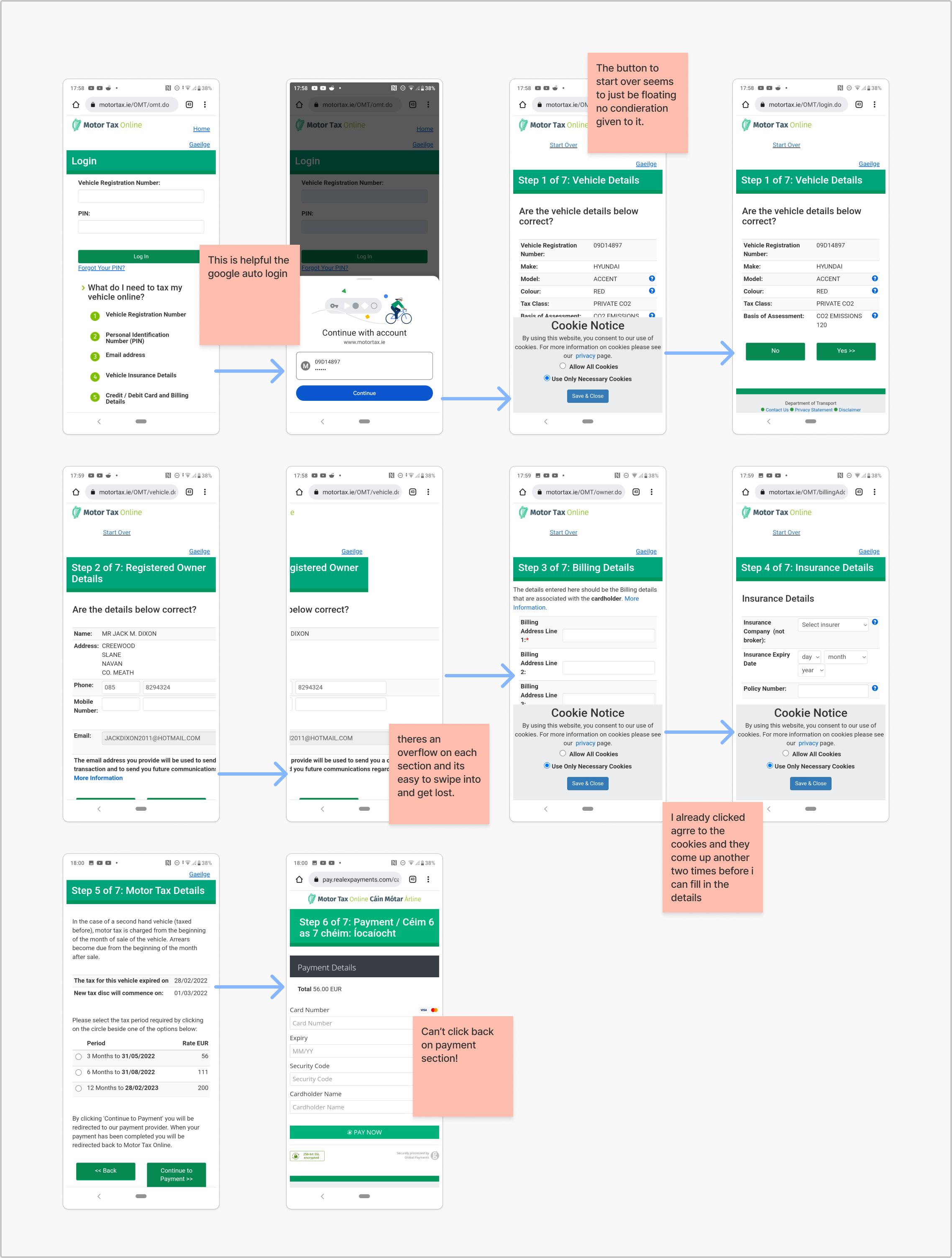
The Irish Motor Tax website generates engagement from over Two million motorists in Ireland annually. The majority of users use the Irish motor Tax website in order to renew their motor tax online. The current renewal interaction has several usability issues which affect Irish motorists.
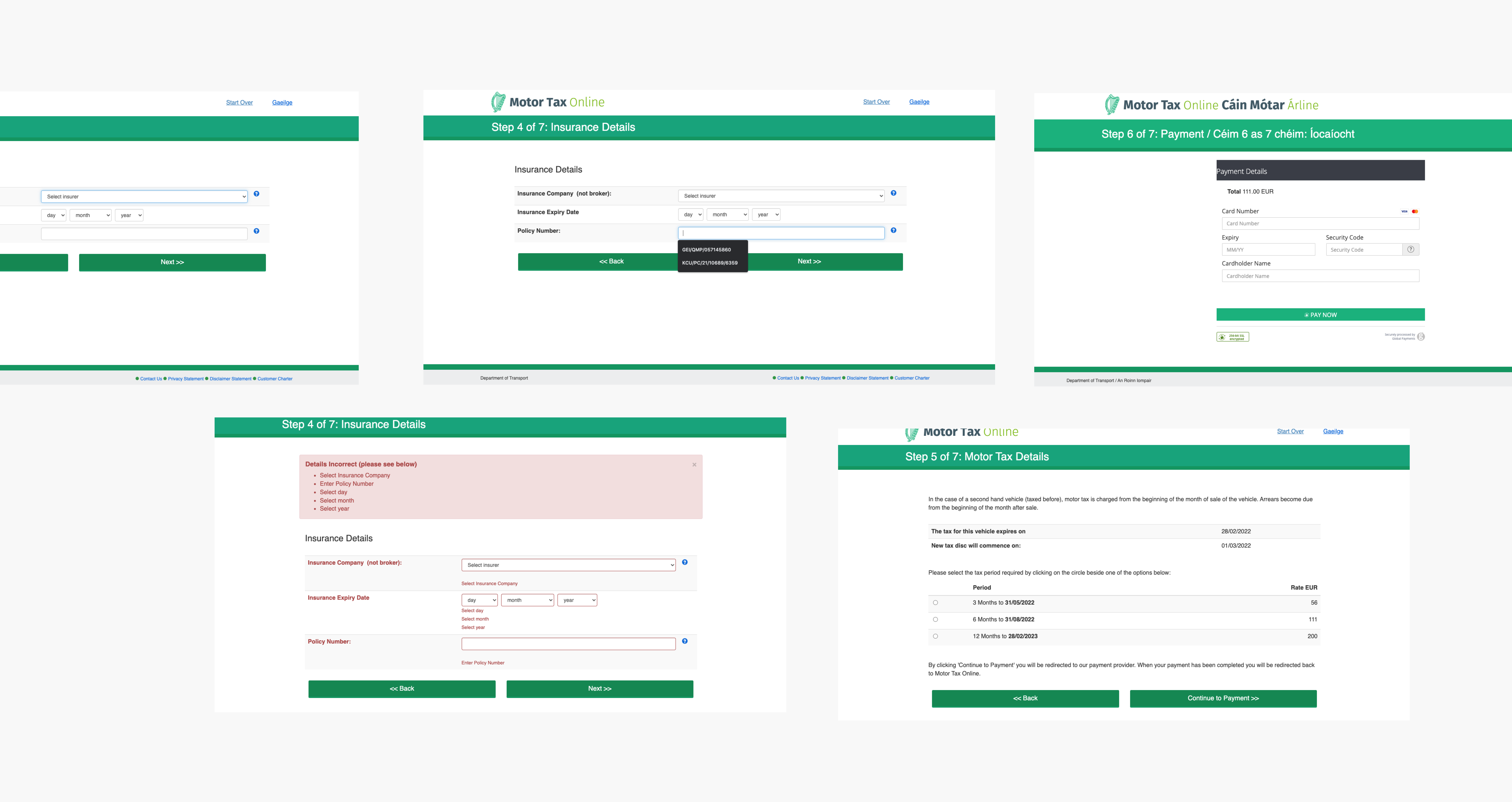
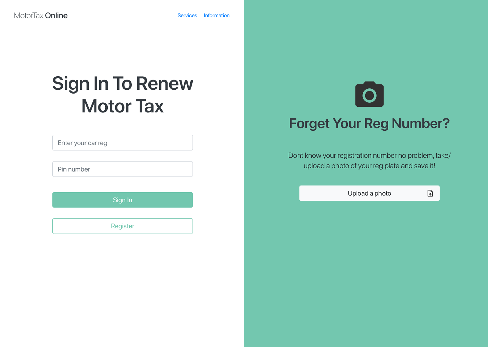
Current Irish Motor Tax website.
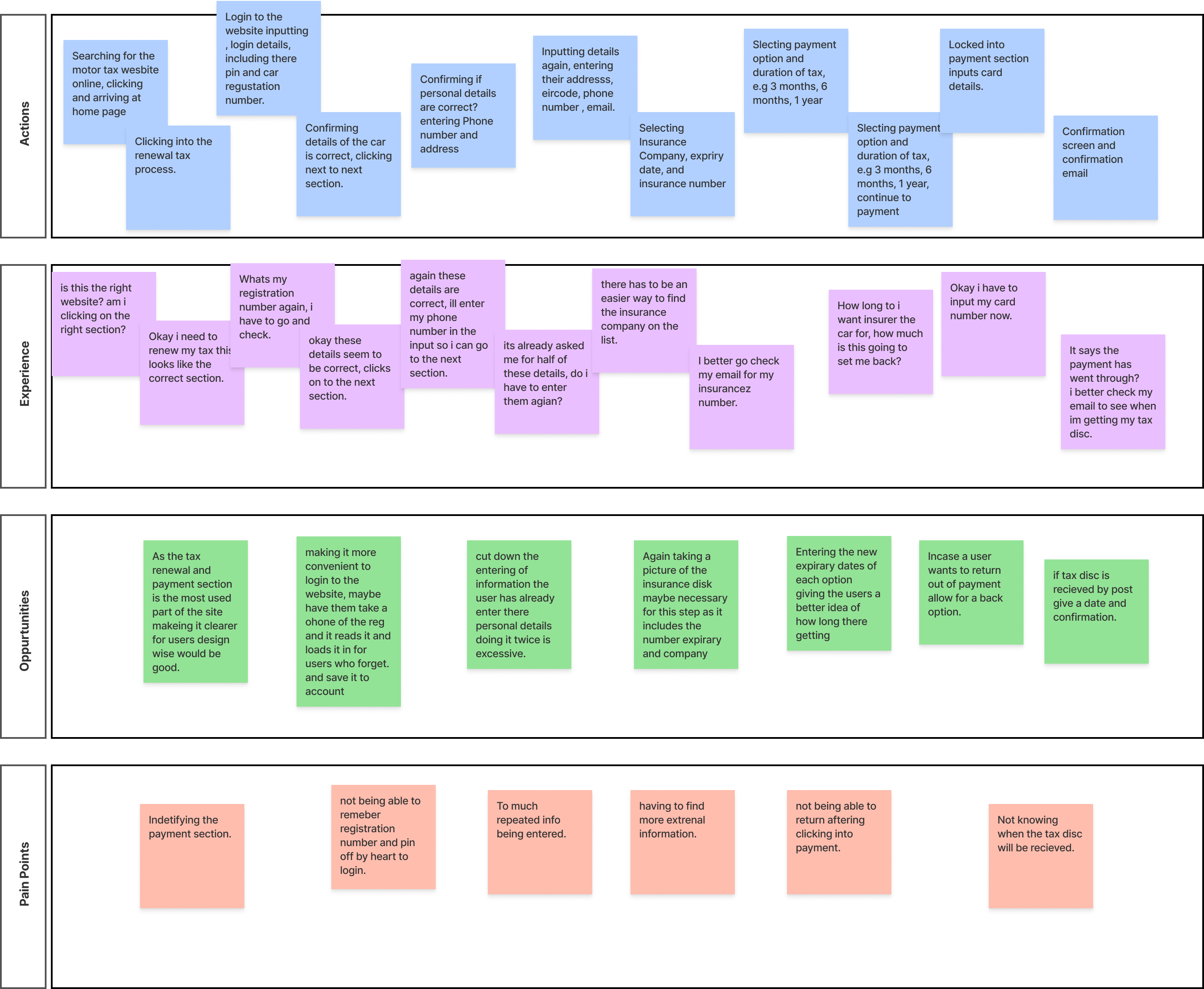
Breaking down the journey under, actions, experience, opportunities and painpoints.
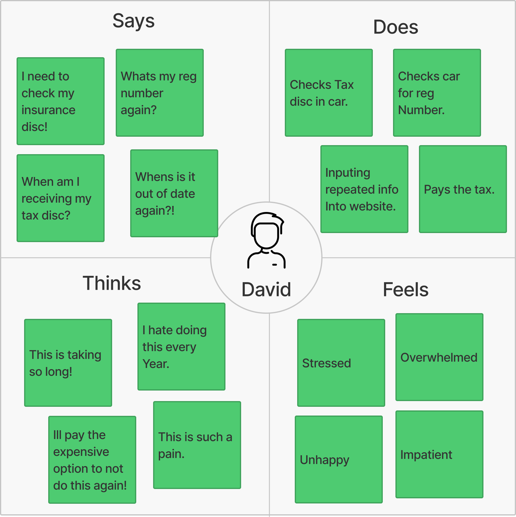
Showing the users experience addressing areas such as saying, doing, thinking and feeling.
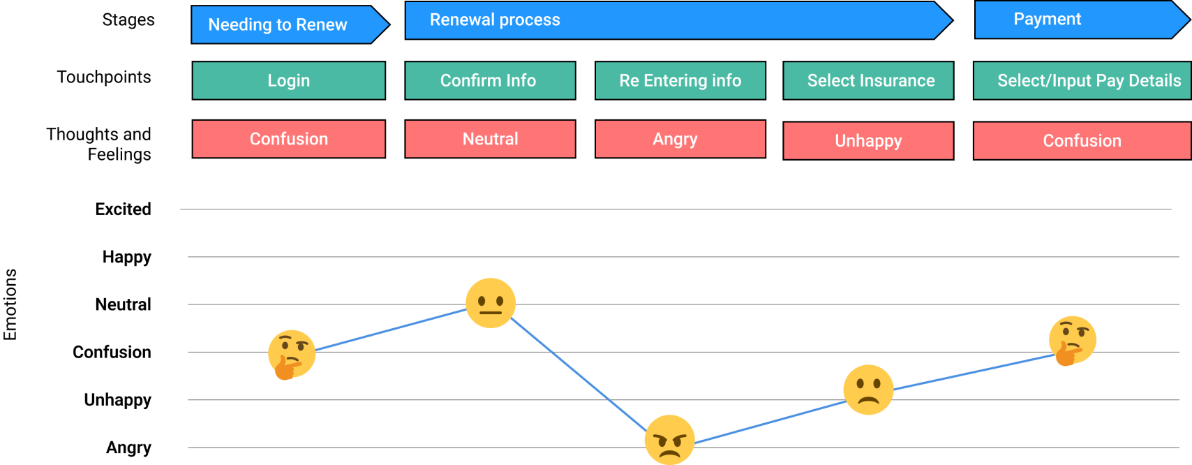
More legiable/visual customer journey.
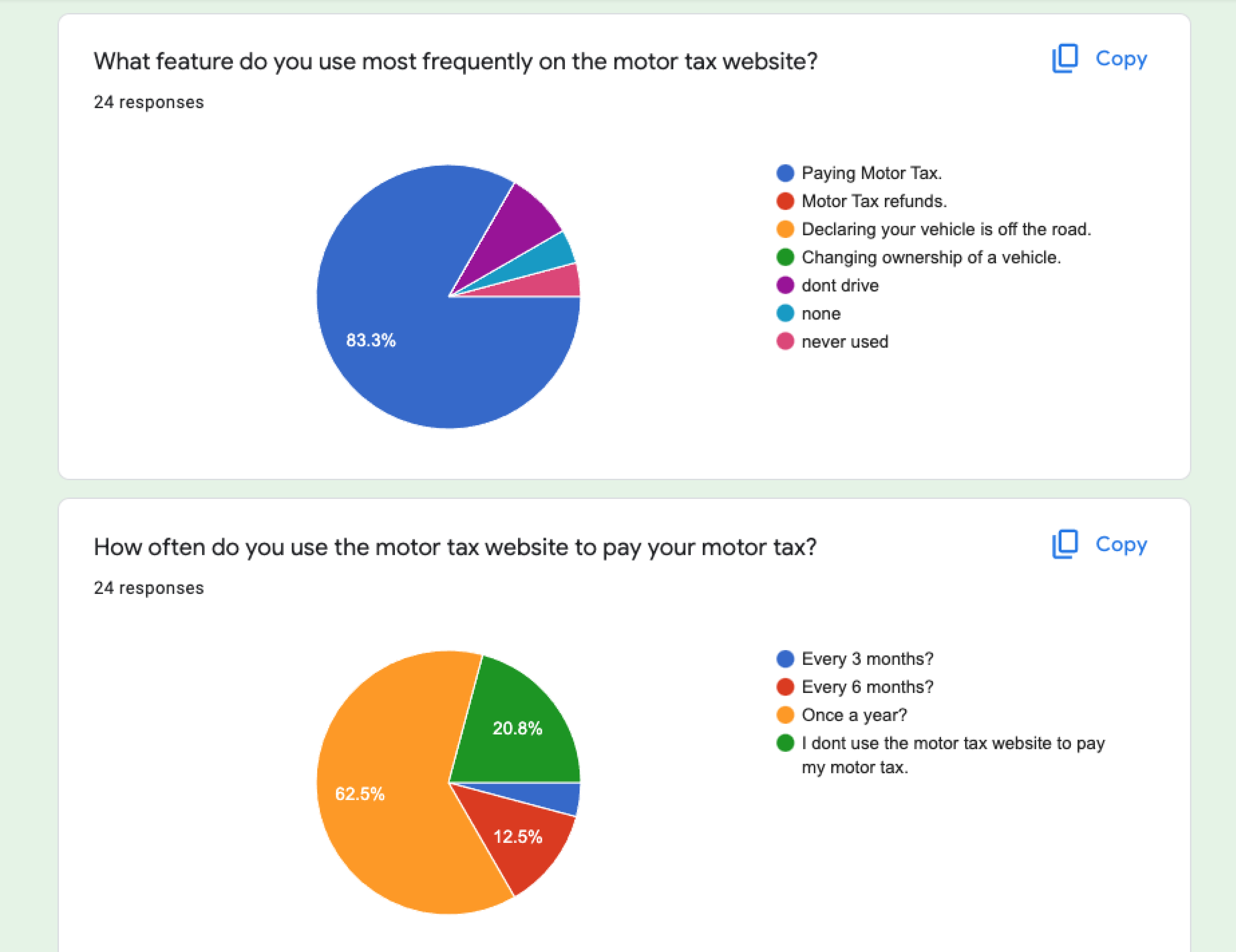
Screenshot from online survey.


Establishing the problem, encompassed both developing an understanding of how the current system affects the organisation, and also how the current system affects end users. Turning the problem into a How Might We allows for the problem to be thought of in an analytical context.
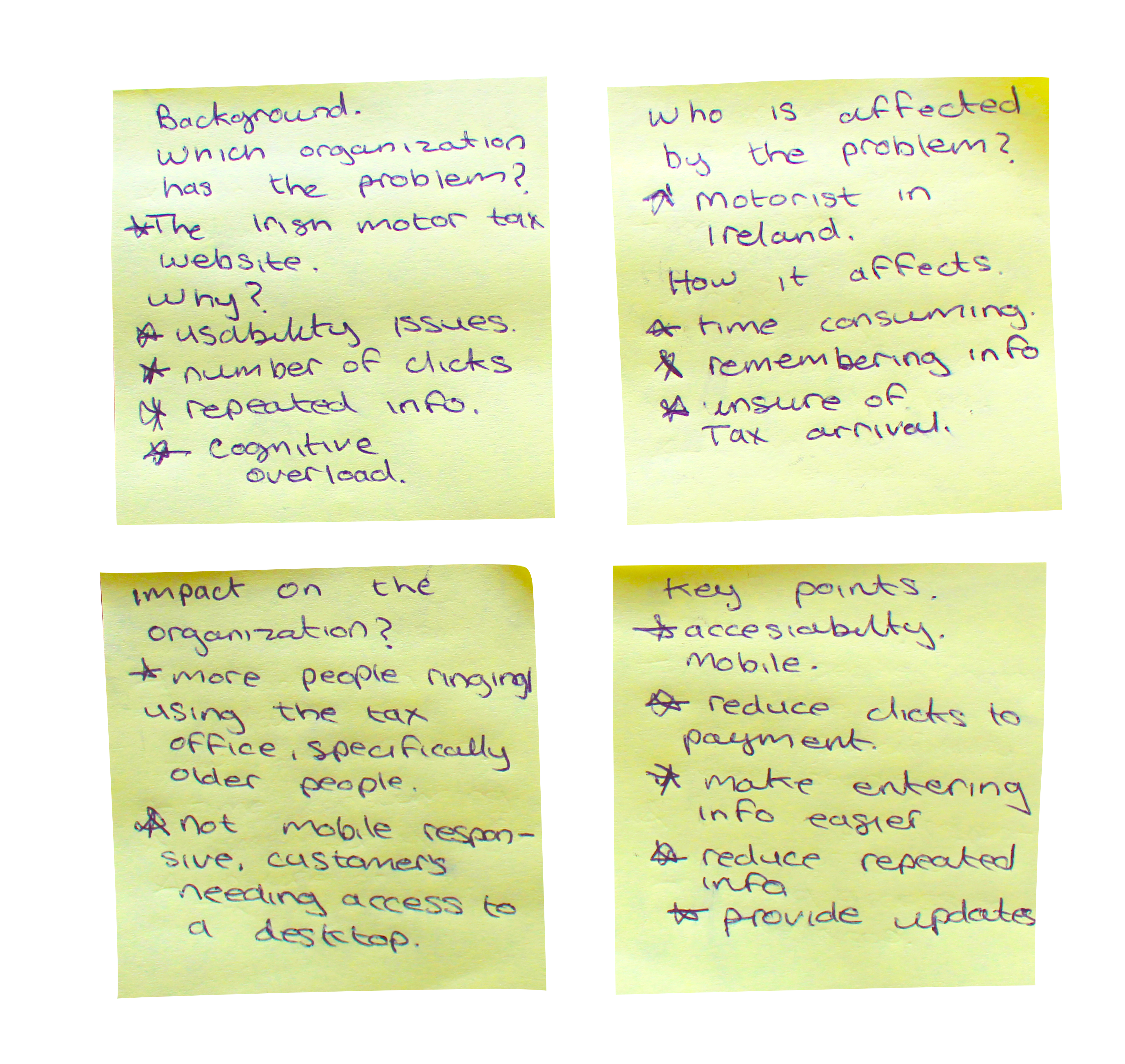
How Might We
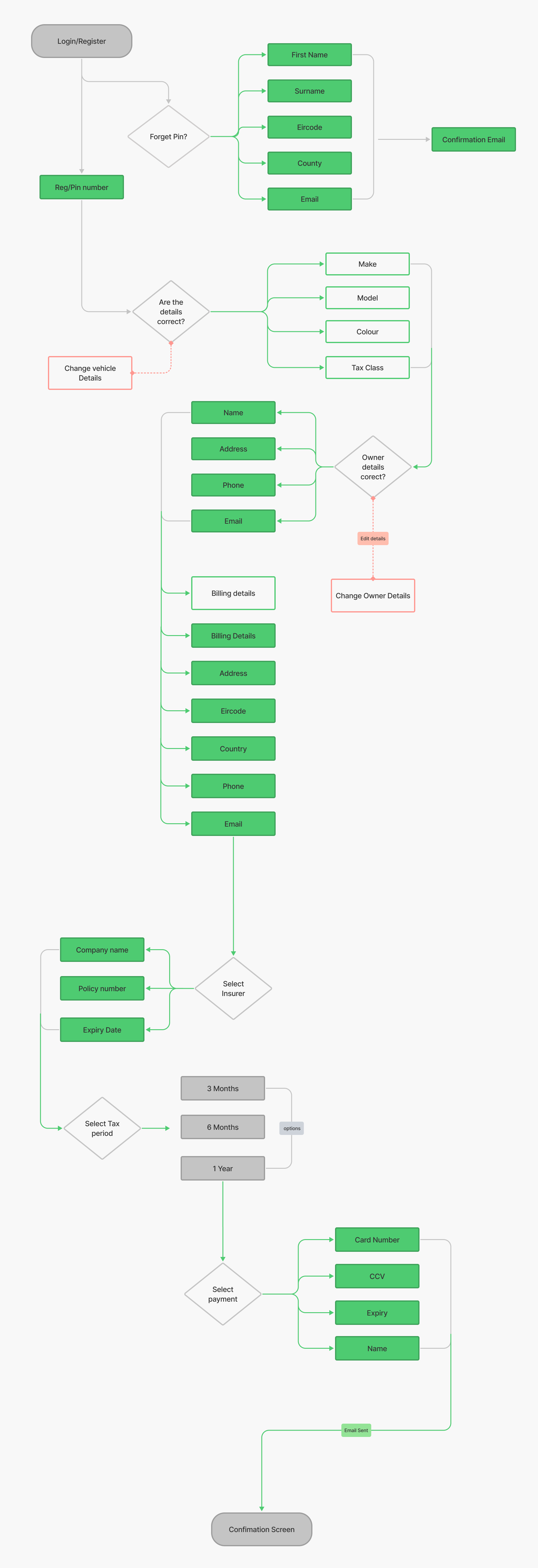
Flow chart of the renewal process of the Irish Motor Tax website. 😬
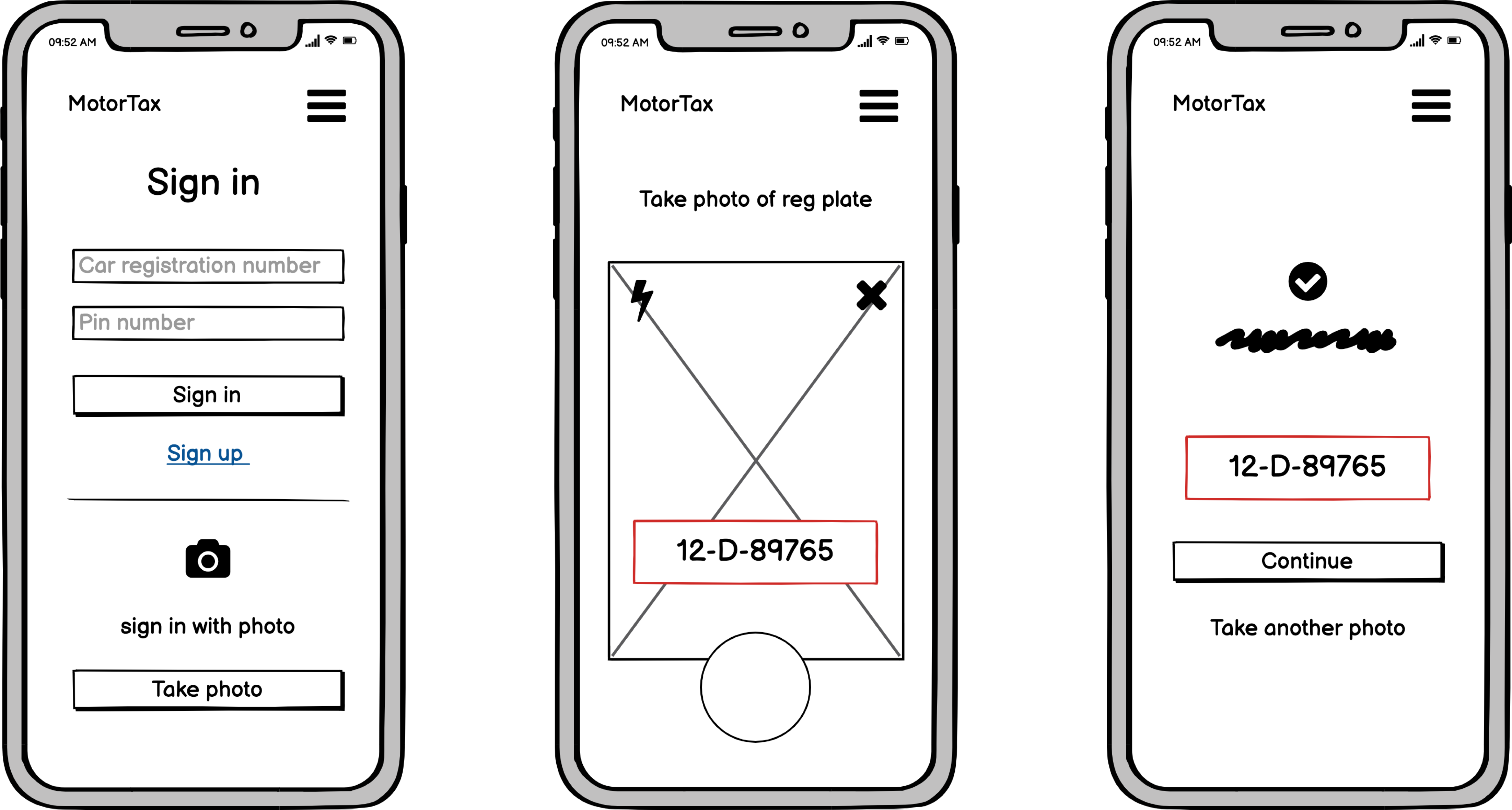
Mobile flow of the renewal process.
Ideation through a number of different concepts before getting into prototyping allowed for consideration of areas such as value to end users and the organisation and overall feasibility of the solution being presented.
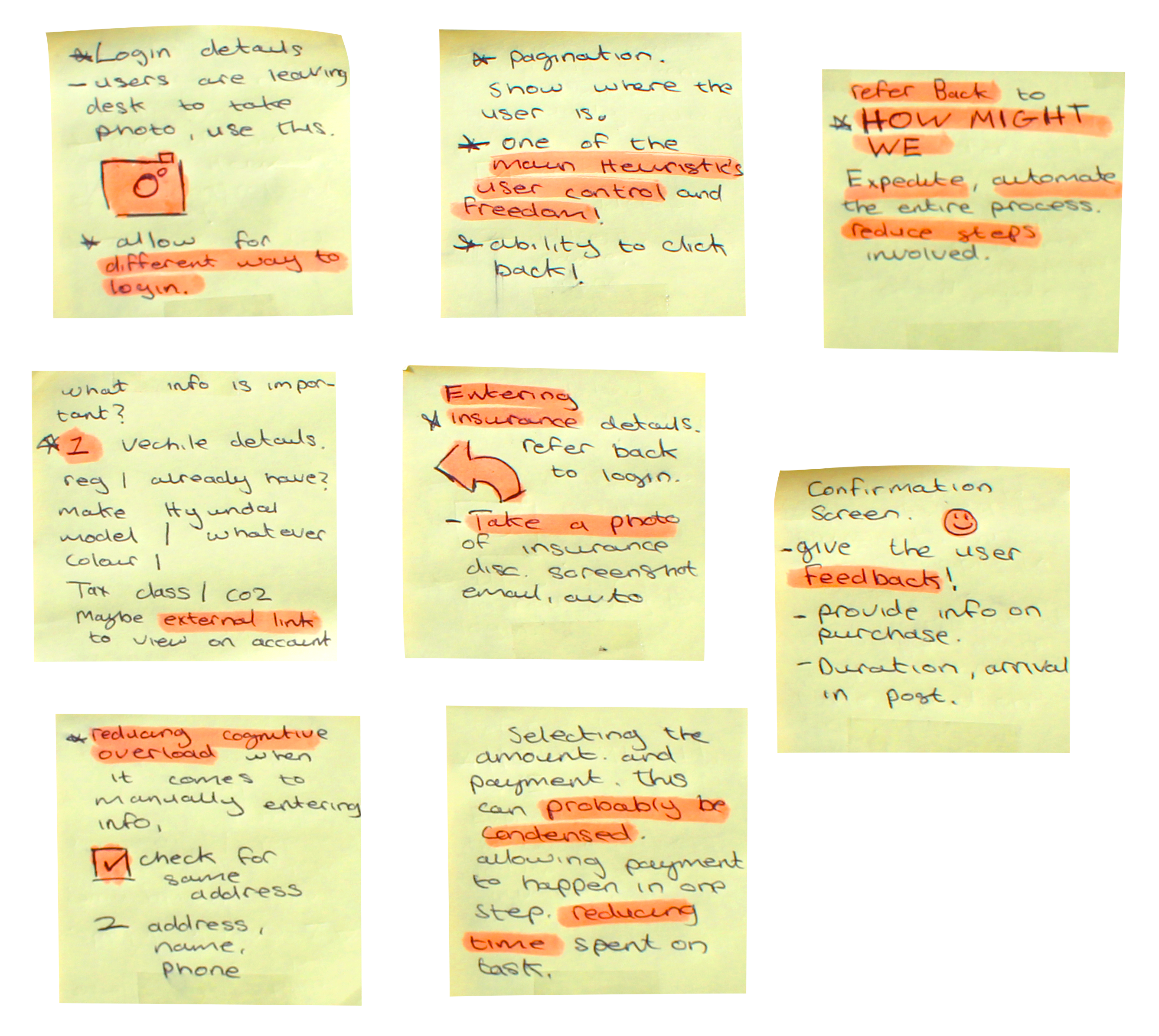
Brain Storming session!
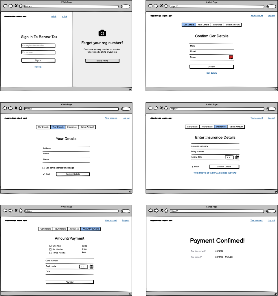
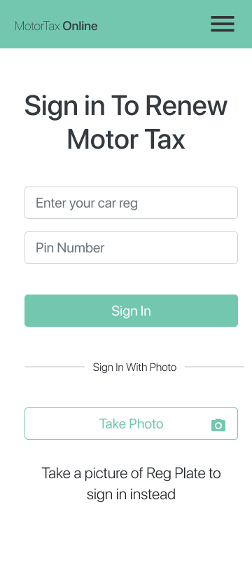
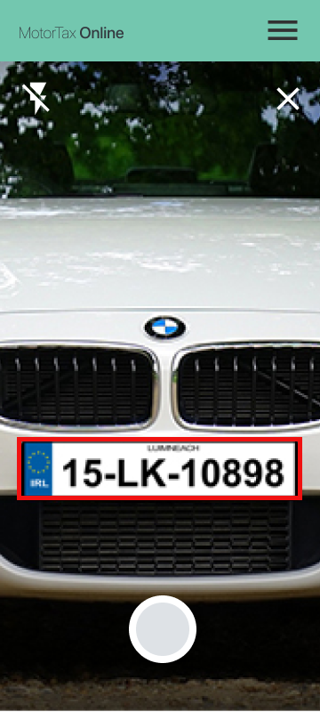
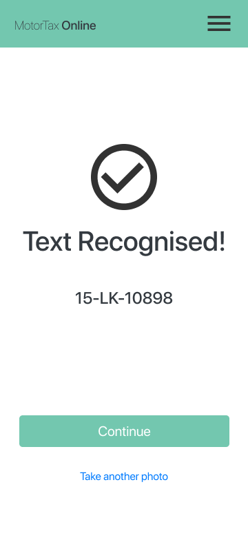
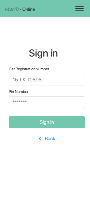
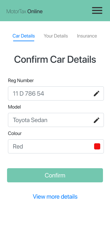
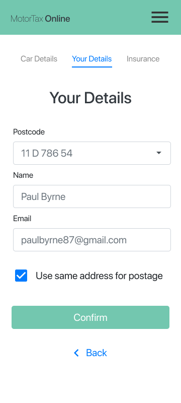
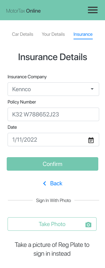
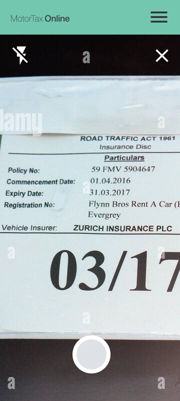
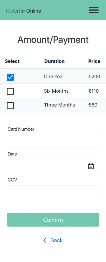
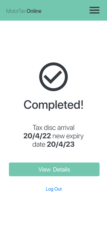
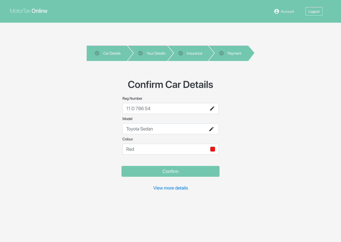
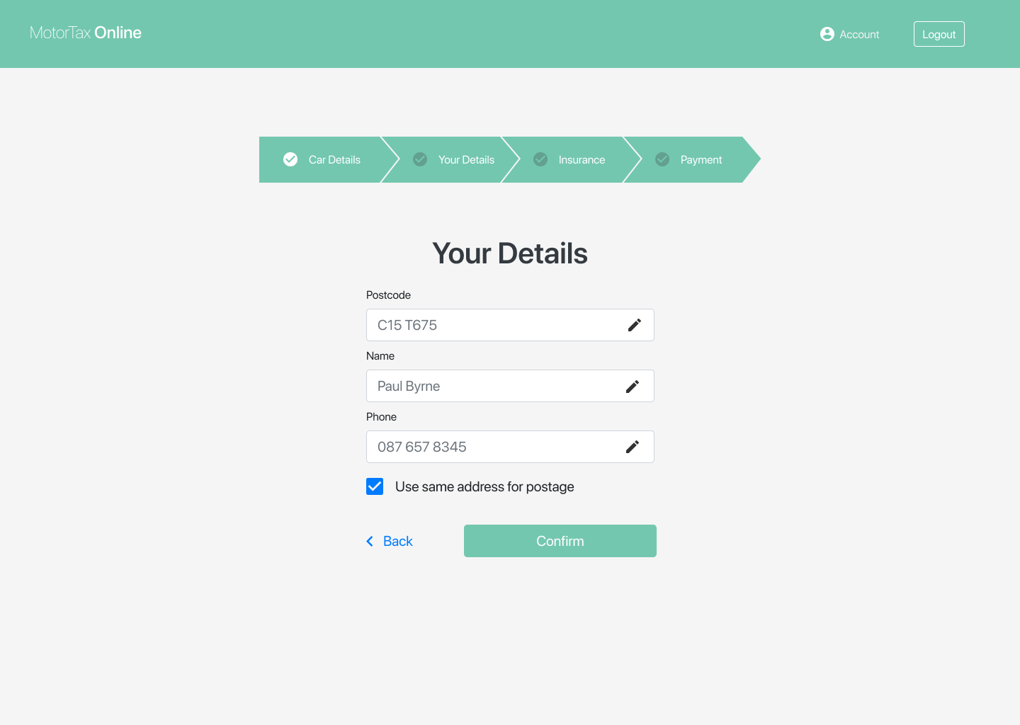
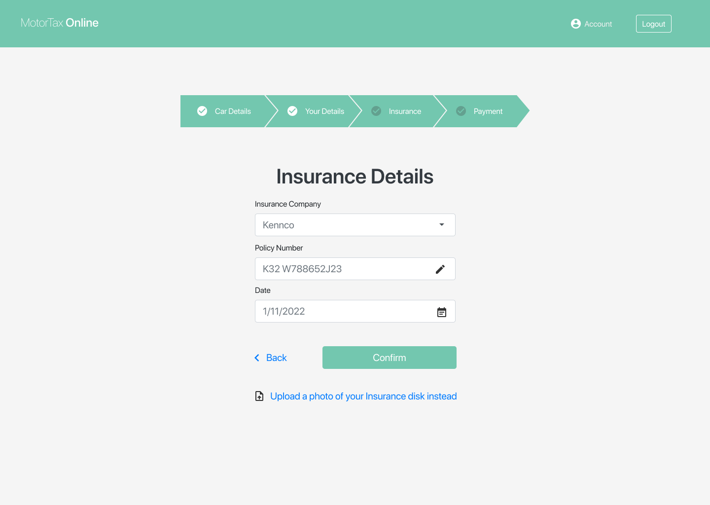
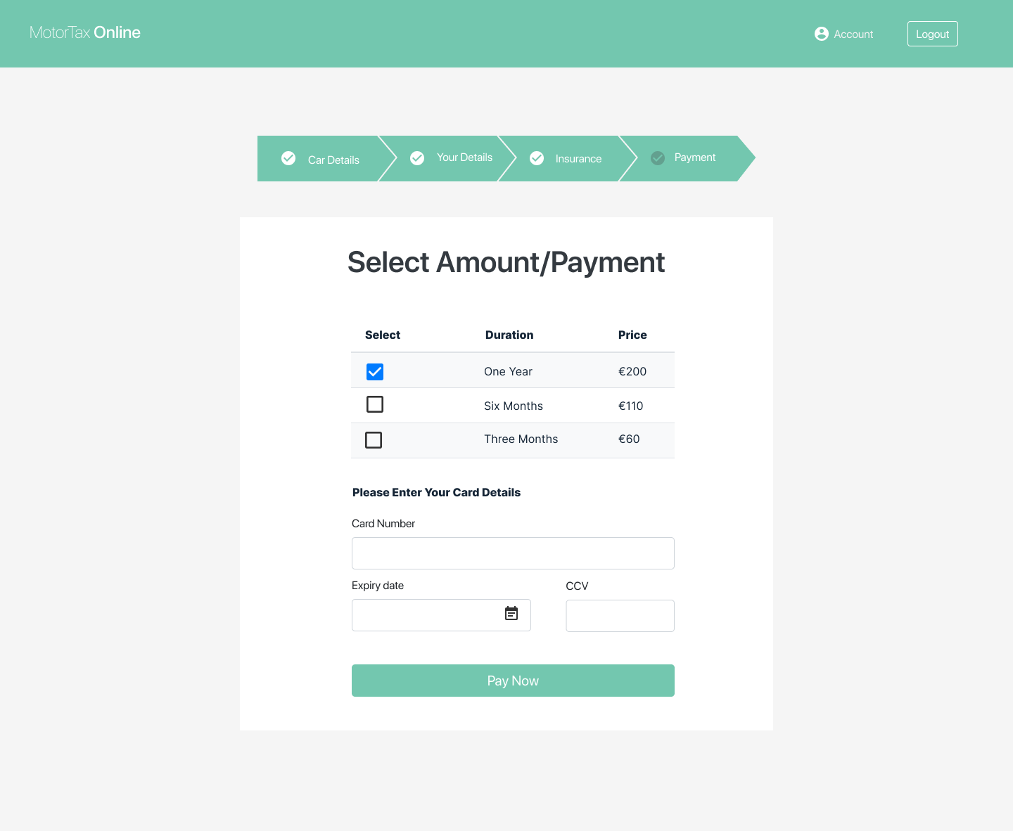
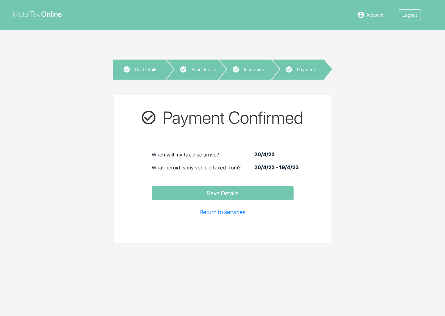
The goal while creating these screens was to condense the process and make it into something more streamline. As opposed to 7 steps, 4 steps reduces time and clicks spent using the product.
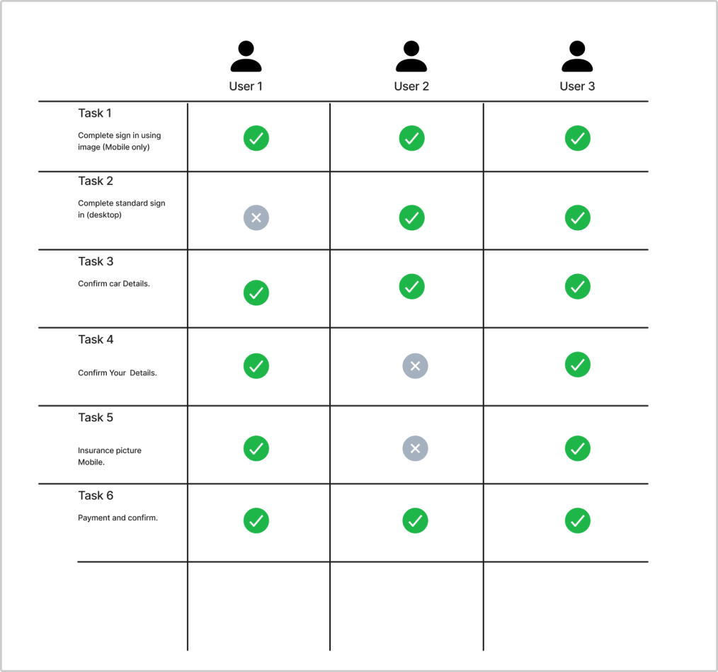
Testing was conducted with a total of three participants who were already familiar with the motor tax website. Two tests were in person (user1 & 2) while one was down virtually. I had the participants go through a number of tasks and took note of completion and encouraged them to talk through their thinking.

If I had more time on this project I would love to expand on accessibility from mobile to desktop design and that translation, especially when it came to areas such as breadcrumbing through each section. Also perhaps the colours and typography don't translate as well between designs when it comes to the high fidelity versions. I would have liked to look into more detail into the technologys relating to extracting and identifying text relating to image just on the feasibility side of the design as a lot of the interaction are centred around this aspect. Maybe in a future case study I would focus on either desktop or mobile to allow for more considerations when it comes to the final design. I only managed to do one round of testing which was good but there's definitely room for another test and iteration!