Unanswered Queries | Genesys
UX/UI • LOW-HIGH FIDELITY •DESKTOP DESIGN
Project Overview
This project focused on creating a seamless transition for knowledge authors as Genesys Cloud migrated customers to their native platform. By translating the look and feel of the existing Bold 360 Voices optimization tools, we ensured a familiar user experience for knowledge authors. The redesigned interface aimed to:
- Empower authors to optimize articles for better customer satisfaction, particularly unmatched queries needing attention.
- Enhance visualization to streamline matching articles with relevant queries.
- Boost platform adoption and retention through a user-friendly experience, benefiting both business and sales teams.
Deliverables
- Low-fidelity mockup/concepts
- High-fidelity mockups & prototypes
- Design system & UI Kit
- Responsive Design
Tools
Qualitative/Quantitative Research, UX Design, UI Design, Design Thinking, Prototyping (Figma).
Duration
The project lasted 2 sprints or 4 weeks.
Interviews with Stakeholders
Interviews were conducted with Internal sales reps from Genesys Cloud to get an idea of the issues from a business POV. At this time sales reps were struggling to sell the product compared to the bold counterpart.
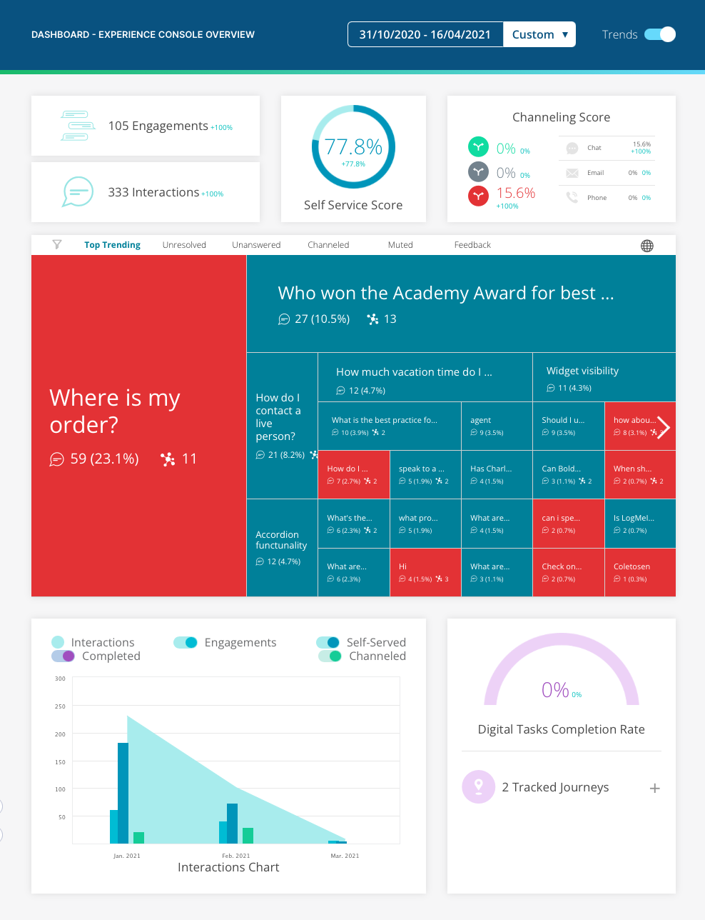
Bold 360 Voices Dashboard.
Key Learnings
- Voice's Importance: Voice data played a crucial role in the sales cycle, as buyers weren't necessarily the system's users. The visual nature of Voices made it easier for stakeholders to grasp complex concepts.
- Real-Time Advantage: Voices offered real-time (or near real-time) insights, allowing executives and stakeholders to monitor knowledge base performance. This data proved valuable for measuring self-service engagement, especially for future mid-market clients.
- Competitive Edge: Voices acted as a differentiator, with its unique visualization tools setting it apart from competitors.
- Visualization for Sales: Implementing a compelling visualization tool could be a "low-hanging fruit" to boost product sales.
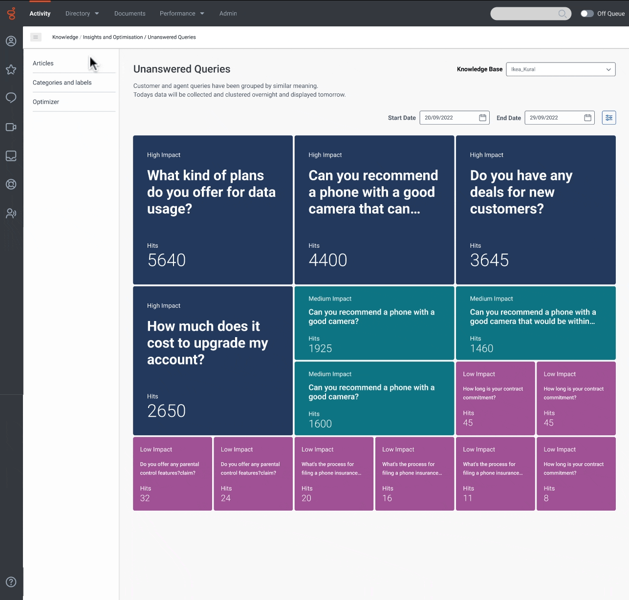
- Focus on Knowledge Optimizers: The primary goal is to provide knowledge base optimizers with visual representation of key phrases.
- Value of Word Clouds: Word clouds offer at-a-glance insights that are easily understood by non-technical users, maximizing the business value of this feature.
Design
Concepts & Iterations 🚀
Mapping out the experience in some Lofi mockups before jumping into high fidelity prototypes/designs these concepts help to also align PM and engineers.
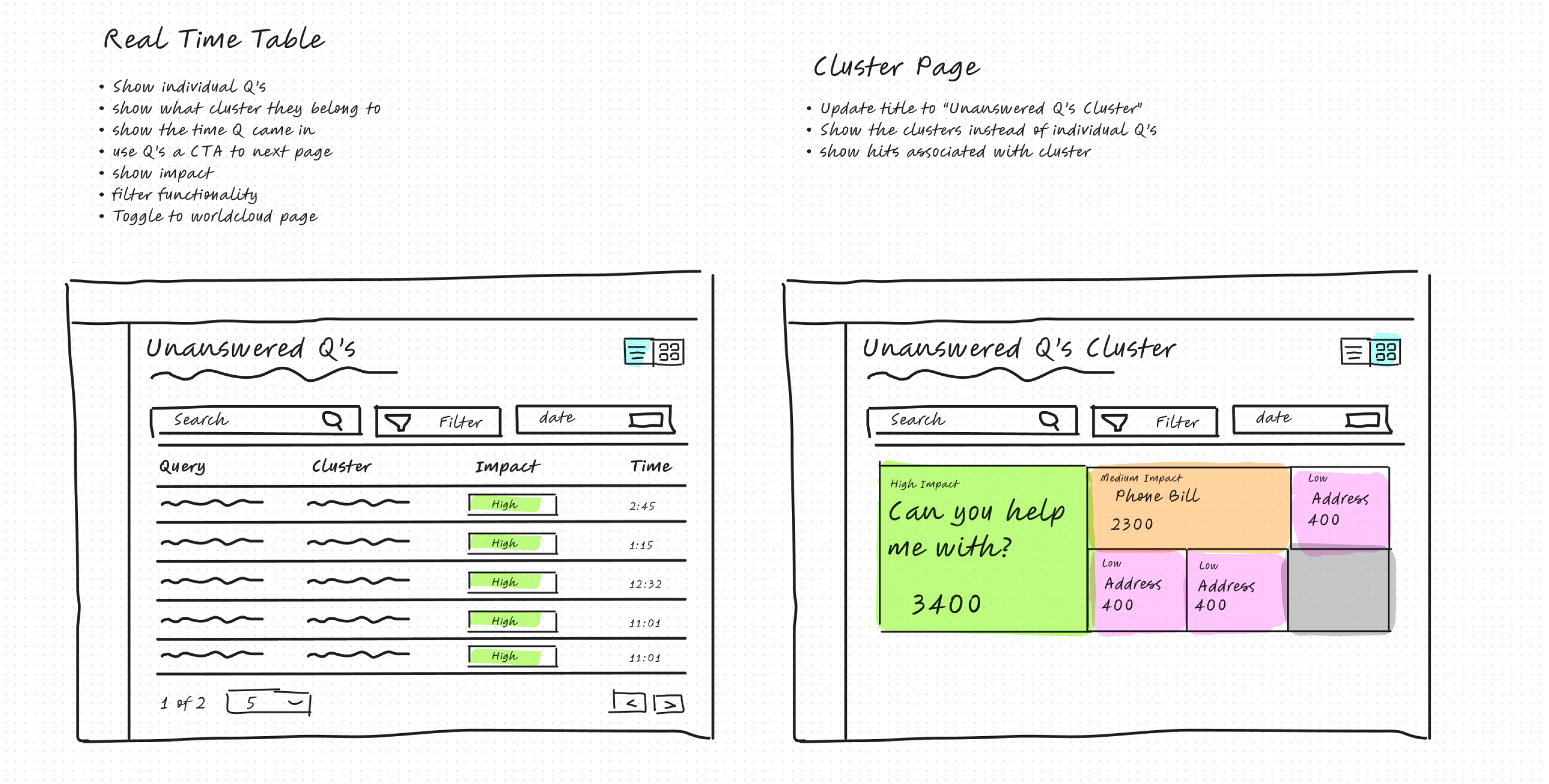
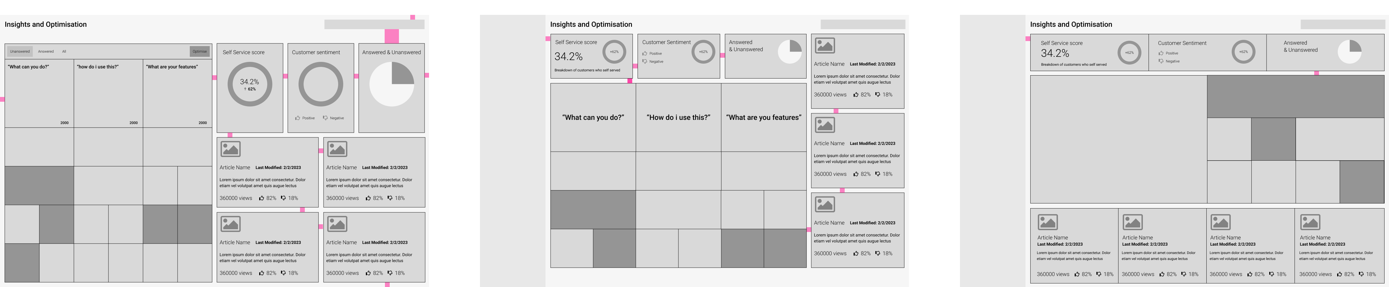
Lofi concepts.
Design System & Dev Handover
As these were custom components i had to define some sort of a design system in the handover file for developers to reference and keep the designs/components consistent.
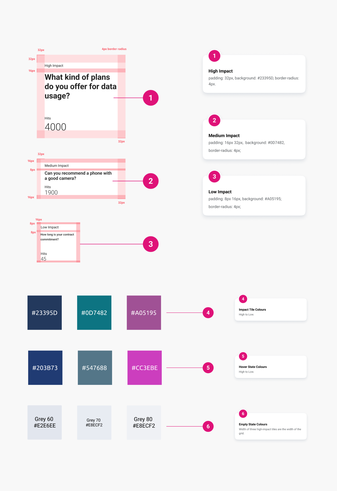
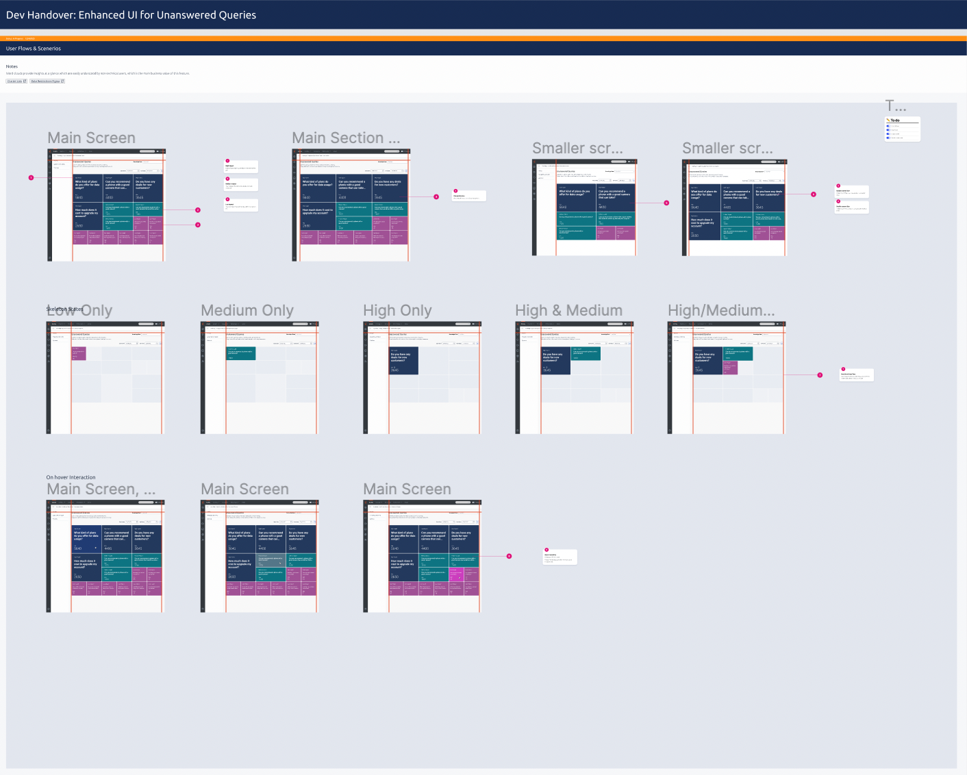
Dev handover file.
Responsive Design
As part of this project, I had to ensure that the design was adjustable across multiple screen sizes. While also giving consideration to when the left nav closes, ensuring the content reacted appropriately.
Responsive gif.
Prototype
As part of this project, I prototyped up a number of multiple concepts to discuss the concepts further with PM & Dev. Linking this new experience to the current experience. Using Figma’s sectioning tool to make the job a lot easier!
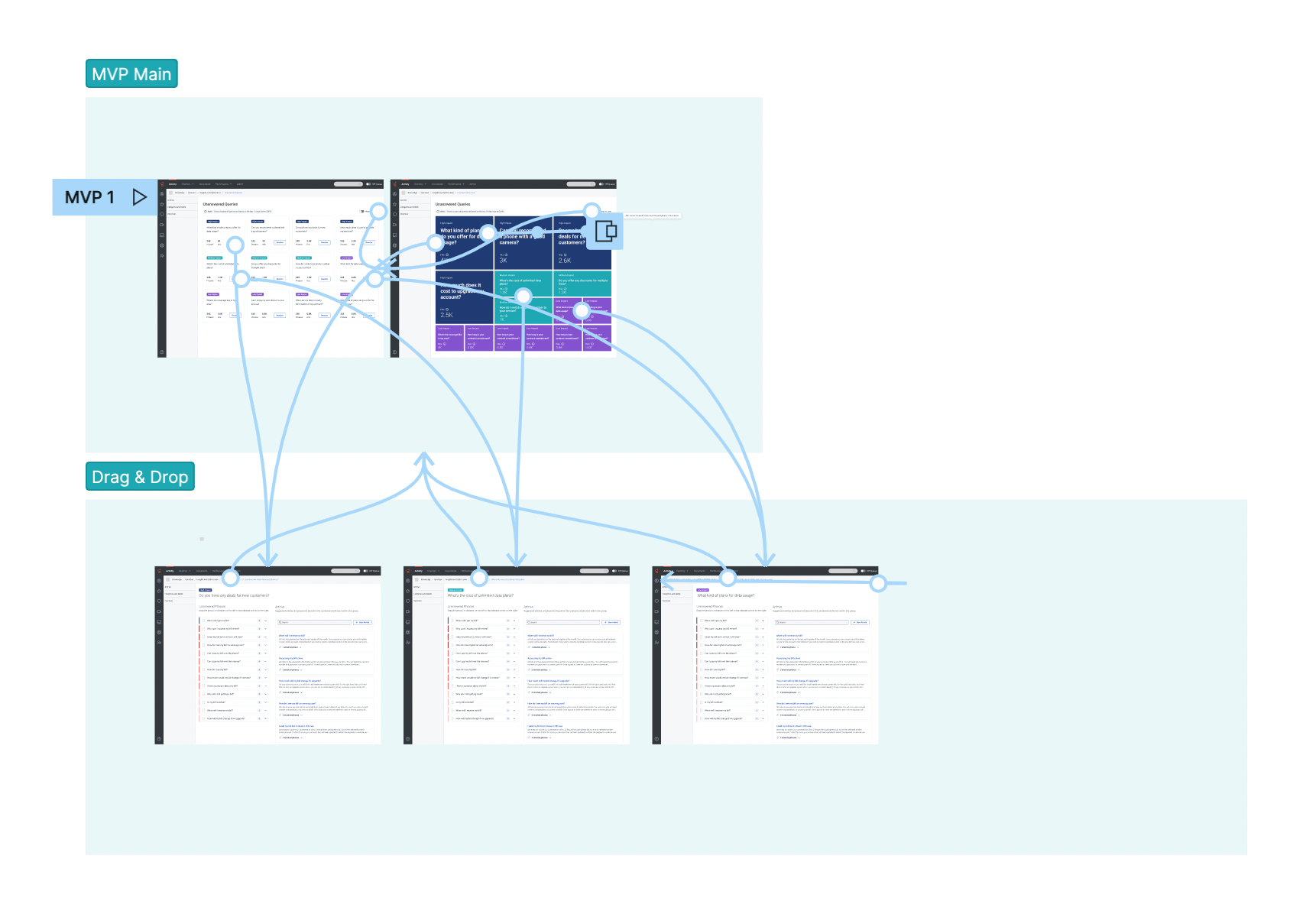
Screenshot of prototype.
Reviewing Work
The build in a live environment.